My experience designing an app that helps students living on-campus at the University of Washington meet their calorie goals affordably.
Project Overview
Project deliverables
User interface
User personas
My role
UI/UX design
Wireframing + prototyping
Visual design
Project context
Design project for INFO 200
Timeframe: 7 weeks
Team: Tejus Krishnan, Angela Dosono, Josh Cho, Susan Yang, Phil Lin, Yvonne Lai
Tools used: Figma
Problem Statement
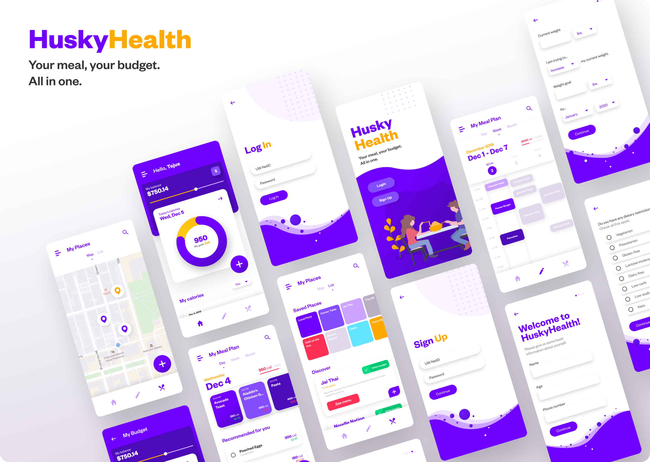
The solution we have designed is a mobile app called HuskyHealth. Improving upon existing health tracking products, HuskyHealth provides a simple yet robust platform for students to affordably achieve their calorie goals with maximum convenience. The app computes a personalized meal plan for students based on their quarterly budget and calorie goal, taking into account their financial status, dietary restrictions, residence, and daily schedule. Students can track their calorie goals and customize their meal plans as they wish.
User Research
For our user research, our team conducted both an online survey and a series of in-person interviews to understand student opinion on the current on-campus dining system. We obtained a random sample of 265 UW students through the student directory and sent them the online survey, leaving it open for 3 days. We received a total of 77 responses.
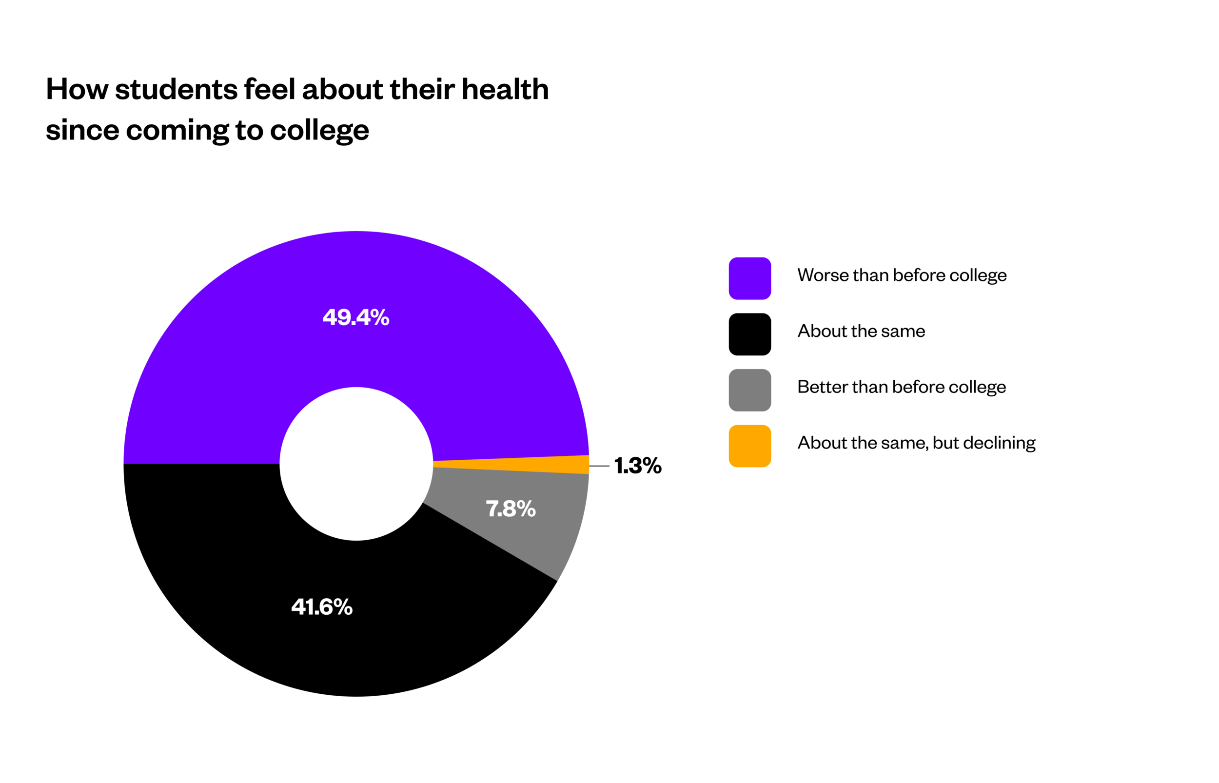
As we can see, almost half our student population feels that their health is worse than it was before they arrived at UW. Based on participants’ answers to questions about their satisfaction with UW’s Housing & Food Services (HFS) dining program, we believe there is a strong correlation between students’ opinions on their dining plan and their perception of their overall health.
Personas
Based on our survey results and the user stories we heard in our interviews, we constructed two user personas reflecting some of the hardships students face in managing their personal health and money within UW’s dining system.
Design Process
Brainstorming & Ideation
Our group held two separate ideation sessions where we refined our project idea on a whiteboard. The first session was for divergent ideas, where we worked off of a simple set of needs based on our user research and ideated solutions that answered each need.
Our second ideation session focused on finding a convergent solution that answered all our user needs. We decided that a mobile app would be the best platform for our system, and narrowed down a set of basic features for the app based on our various divergent solutions.
We ultimately decided that the app’s main two features would be to…
Recommend its users a meal plan (which scales to a daily, weekly and monthly timeframe)
Allow its users to track their progress with that plan and modify it as they see fit.
Since one of our user needs was convenience, we also chose to integrate a “my places” feature into the app that identifies nearby areas to find food that falls under students’ budget.
Wireframing & Prototyping
With our features locked in, our next step was to map out the app’s usability with a series of wireframes and low-fidelity prototypes. We drew out the initial wireframe on a whiteboard to create the structure for the app’s navigation and envision what some of its main screens would look like.
Visual Design
Based on our wireframes and paper prototypes, I used Figma to build a lively, engaging user interface for our app. The aesthetic choices for our design were focused on making the product feel accessible and seamless, in order to eliminate the drudgery that users frequently reported feeling when using current calorie-tracker apps.
As for HuskyHealth’s brand identity, the color scheme is consistent with UW’s signature purple-and-gold palette, which allows the app to feel like a natural extension of students’ campus experience. Meanwhile, the emphasis on rounded shapes and spatial minimalism in the UI makes the app stand out from UW’s existing digital products and conveys a sense of freedom and improvement upon users’ current lives.
Final Design
Reflection
This was my first full-fledged UI/UX design project, and my subsequent work has sprung from the design skills and intuitions I built while working on HuskyHealth. As such, I have a number of important takeaways from my experience.
Points of growth
In the months our team worked on this project, I spent much of my free time teaching myself how to use software like Figma, Adobe XD and Photoshop, and collecting examples of inspiring UI design work from Dribbble, Behance, and a wide array of professional case studies. I’m proud to have gone the extra mile building those hands-on foundations for myself, since it allowed me to personally gauge my strengths as a designer and narrow down the specific kinds of projects I’d like to work on in my career.
I was able to utilize what I learned in intro-level design courses at my university to coordinate some of our early team ideation sessions, which helped streamline our efforts to implement a solution based on our user research. All of our project members strove to ensure that our team was well-coordinated and met deadlines early, which made the design process move far more smoothly.
For next time
Seeing as this was my first end-to-end UX design project, I had relatively little knowledge of the underlying structural components of a user interface, particularly layouts and grid systems. If I were to iterate on this project, my first step would be to apply a usable layout to all my screens and follow a design system such as Google’s Material Design to ensure consistency throughout the deliverable.
This product would benefit immensely from user tests that provide concrete feedback on specific aspects of the app’s interface and interaction mechanics.
I chose to emphasize lighter colors on the UI to feel cleaner and more spacious than UW’s existing digital student resources. However, I would conduct an accessibility audit of the current iteration to ensure that my color and contrast settings are comfortable for all users.
Thank you for reading! If you enjoyed this project, go ahead and share it out to your social media.


